

- Research platform
Sources of information
Data analysis
Actions

- Solutions
For whom
Problems / Issues

- Materials
Materials
- About us
About us
Analytics data tells us “what happened,” but doesn’t explain “why.” A store sees in Google Analytics that 68% of shopping carts are abandoned during the delivery selection stage—but only a simple question in a micro-survey reveals that the barrier is the lack of package lockers on weekends. In SaaS, users abandon the onboarding process after the integration step—a micro-survey shows that the problem is an unclear explanation of access permissions. Feedback allows you to identify the reasons for cart abandonment that no dashboard alone can reveal.
There’s a huge difference between asking for feedback a week after a purchase and asking at a critical moment when emotions and context are still fresh. Real-time feedback allows you to respond quickly to customer needs—before frustration turns into brand abandonment. But be careful: poorly implemented micro-surveys—aggressive pop-ups, too many questions, or screen blocking—ruin the customer experience and lower conversion rates. When implemented well, they’re almost invisible, yet they provide valuable insights into real barriers.

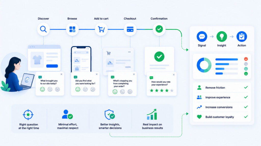
On-site micro-surveys are short, context-sensitive questions displayed to users at a specific point in their journey—for example, after submitting a form, after a search yields no results, or after making a purchase. A good micro-survey typically includes:
Microsurveys are part of the Voice of Customer and UX research programs—they help you study customer experiences and preferences in real time. They can be displayed across various digital channels: on a website (widget, banner, bottom sheet), in mobile apps, in the customer dashboard, and even in an embedded web view within a transactional email. These surveys help analyze customer needs and preferences exactly when those needs arise.
A traditional survey consists of 10–20 questions and is sent once a quarter or after the entire purchasing process. It works well for strategic customer satisfaction and loyalty surveys—such as an annual NPS survey among all customers. NPS surveys measure customer loyalty within the broader context of the relationship with the brand.
A micro-survey consists of 1–2 questions, triggered “right here, right now”—after a customer navigates to the order confirmation page or closes an article in the help center. Microsurveys do not replace traditional surveys, but rather complement them with feedback collected close to the point of experience. In 2026, a company might conduct an annual NPS survey while simultaneously running CSAT and CES microsurveys at critical points in the customer journey.
Users act quickly and use multiple devices and various channels. If something bothers them, they rarely contact customer service—more often than not, they simply leave. Analytics will show a drop in conversion rates, but it won’t reveal that 35% of customers abandon their carts due to high shipping costs, 22% of users give up on their purchases due to a complicated checkout process, and the lack of a preferred payment method causes 18% of customers to abandon their carts.
Website navigation influences 15% of users’ decisions to abandon their carts, and website security is a key factor for 17% of customers who abandon their purchases. These details aren’t visible in raw analytics. The question “What prevented you from completing your order?” asked after returning from checkout to the shopping cart reveals real barriers—not just abandonment statistics. Customer feedback from micro-surveys helps understand customers’ needs and expectations.
In B2B SaaS: users do not convert after a 14-day trial. A micro-survey asks, “What most prevented you from extending your access?” and gathers information about missing integrations or prices that are too high. Collecting feedback improves the quality of products and services, reduces churn, and helps build relationships. Personalizing offers based on the collected data increases customer loyalty by 60%. This leads to greater customer satisfaction and long-term growth, as feedback boosts customer loyalty by 60%.
This is where most companies make a mistake—by prioritizing feedback collection over the smoothness of the user journey. It’s crucial that micro-surveys appear at the right moment.
When NOT to display a micro-survey:
When the micro-survey is a natural part of the process:
Micro-surveys should ask only one or two questions and make it easy to close them. The goal is to minimize cognitive load—the survey appears when the user naturally takes a “break.” It’s worth testing the impact on conversion through A/B testing, comparing a variant with a post-purchase survey versus one without, and measuring the difference in transaction completion rates. This allows you to address user needs without harming results.
Timing is the most important technical parameter for micro-surveys—it determines whether we’ll collect valuable customer feedback without annoying them. It’s worth using a combination of triggers: after an event, after a certain amount of time on the page, or based on user behavior (scroll, exit intent). Microsurveys play a key role at critical stages of the customer journey, but with different display thresholds depending on the channel.
This is the safest time to collect customer feedback. Examples: after a successful purchase (the “Thank you for your order” page), after completing a purchase, after finishing account setup in a SaaS platform, or after submitting an application. A short post-conversion survey gathers feedback after a purchase or sign-up.
Recommended metrics: CSAT (“How would you rate the ease of this process?” on a scale of 1–5) or CES. It’s worth adding an optional open-ended question: “What could we improve?”—without forcing a response. For online stores with high order volumes, it’s advisable to limit the micro-survey to a randomly selected 5–10% of sessions to avoid overwhelming users.
This is the most valuable moment to identify actual barriers in the shopping experience—the problem has just occurred. Examples: form validation error, no search results, declined card payment.
Questions: “What stopped you at this stage?”, “What was missing from the search results?”, “What was unclear about this form?”. Important tip: Don’t blame the user—don’t ask “Why didn’t you manage to…,” but rather “What made it difficult to…”. Such micro-surveys should be as discreet as possible, e.g., a small bar at the bottom of the screen.
Signs of hesitation include: prolonged inactivity, scrolling up and down multiple times without taking action, moving the cursor toward closing the tab (exit intent), and repeatedly going back during checkout. Exit-intent surveys appear when a user is about to leave the page.
A micro-survey can gently ask a question instead of trying to retain the user with a discount—such as “Was there something missing on this page?” or “What stopped you from completing your order?” The format should be unobtrusive: a small “speech bubble” or bottom sheet. In B2B, it’s better to use exit-intent surveys sparingly and instead monitor repeated visits to the pricing page without a conversion.
Many companies are shifting customer service to self-service help centers—here, micro-surveys measure whether the content solves problems. Typical locations: FAQ articles on shipping and returns, setup instructions, guides, and SaaS help centers.
Simple questions: “Was this answer helpful?” (Yes/No), “What was missing from this content?” Scroll-triggered surveys appear after 70–80% of the article has been read. If the user clicks “No,” it’s a good idea to display a short, optional comment field. These micro-surveys are a source of ideas for new articles and content updates without the need for extensive research.

There’s no room for ten questions in micro-surveys—what matters is one well-chosen, simple question related to the stage of the customer journey. Effective questions must be short, relevant to the current context, neutral, and ask about one thing at a time. It’s a good idea to base the wording of your questions on the language users themselves use in comments, on social media, or in conversations with customer service.
Bad example: “How would you rate our website, our offerings, our payment process, and our customer service?”—too many topics at once. Good example: “What made it difficult to complete your order?”—one question, specific context, open to the actual reason.
Rating scales are better than open-ended questions in micro-surveys if the goal is to measure user experiences on a large scale with a low response barrier. Examples: a 1–5 CSAT scale, a CES scale ranging from “very difficult” to “very easy,” simple “Yes/No” options, and smiley face icons.
Closed-ended responses are easy to combine with quantitative data analysis and to track trends over time. It’s best to use 3–5 options to avoid overwhelming the user. A closed-ended question can serve as the first step, followed optionally by a short open-ended question for low ratings (1–2).
Open-ended questions provide the most valuable qualitative insights—customers’ own words and the root causes of problems. Examples: “What was unclear about this step?”, “What was missing from this page?”, “What could we improve?”. The response should be optional, with this fact clearly indicated—that way, the user doesn’t feel pressured.
Analyzing open-ended questions requires systematic tagging and often the support of text analysis tools, but it yields direct quotes that are useful for product decisions. It’s a good idea to pair one closed-ended question with one short open-ended question instead of several lengthy fields. Users are more willing to share their experiences when the question is short and pressure-free.
CSAT (satisfaction with a specific experience) and CES (ease of completing a task) are very well suited for micro-surveys following a specific event. NPS measures customer loyalty and the likelihood of recommending a brand, but it’s better to ask it less frequently—once every few months.
Examples: “How would you rate this purchase?” (CSAT), “How easy was it to add the product to your cart?” (CES), “How likely are you to recommend us to a friend?” (NPS—preferably in a separate survey). In on-site micro-surveys in 2026, it’s better to use mainly CSAT and CES, and treat NPS as a separate module within the Voice of Customer program.
Microsurveys are part of UX and should be designed with the same care as forms or checkout pages. Bars placed below the header are unobtrusive and don’t obscure the content—this is one of the safer formats. An intuitive survey interface provides users with a positive experience rather than frustration.
Design principles:
With each implementation, compare conversion and abandonment data for users who saw the survey and those who didn’t. This gives you a better chance of collecting feedback without negatively impacting your results.
Below you’ll find ready-to-implement ideas. Start with 2–3 scenarios—such as checkout, search, and help center—and only add more touchpoints once you’ve learned how to work with the data. These scenarios can be used in online stores, web apps, PWAs, and mobile apps.
Users compare products, view photos, read descriptions and customer reviews, and check specifications. Goal: to understand what’s missing to help them make a decision. Embedded surveys are placed within the product description or below it.
Format: a small widget that appears after 10–15 seconds on the page or after scrolling through 75% of the content.
The user has a specific intent and expects good results. Goal: to understand when the results don’t meet expectations. Pop-up widgets—small windows that appear from the corner of the screen—work well in this scenario.
Format: a small bar below the list of results when the number of products is 0–3.
This is a critical part of the customer journey, where any disruption means lost revenue. Feedback helps identify the reasons for cart abandonment—specific barriers related to shipping, payment, or customer trust.
Format: a micro-survey after returning from /checkout to /cart or an exit-intent prompt. Do not display the survey during the online payment process.
Friction in a form means lost leads and potential customers. Goal: Identify unclear fields, overly long forms, and data-related concerns. This allows you to shorten forms and improve conversion rates without guesswork.
Timing: after multiple errors or after successful submission (CSAT question about the ease of the process).
Users look for solutions on their own instead of contacting customer support. “Feedback” widgets allow users to close or ignore them, which is particularly important here.
Format: a small panel at the end of the article, two icons (thumbs up/down) with a short comment field. Repeated “No” responses signal the need for an immediate content update.
The first few days of the trial determine conversion. Goal: to identify steps that are unclear or don’t trigger an “aha moment.”
Timing: after completing a key step (CRM integration, first project, inviting the team). Regularly analyzing feedback helps shorten the onboarding process and better tailor messages based on user suggestions.
The answer “Too expensive” is not very useful on its own. Only when combined with context does it provide real insight and a better understanding of the situation. Types of contextual data to combine with micro-survey results:
CX platforms can automatically link metadata to responses and present them in reports. By integrating behavioral data with feedback, you can conduct true causal analysis. Example: A high percentage of “No preferred payment method” responses in mobile traffic from social media may indicate a need for BLIK or Apple Pay. Collecting feedback increases conversion by 20% when data analysis leads to specific changes. This is the path to personalizing your offer based on real needs.

Simply collecting feedback is worthless if no one analyzes it or plans to implement changes. Analyzing feedback allows you to improve the quality of products and services, but it requires a process.
A simple analysis framework:
The analysis should focus on recurring patterns rather than on individual, high-profile user opinions—30 similar comments in a month is a signal; 1 comment once a year is just a curiosity. Collecting feedback improves the quality of products and services because it allows you to respond to negative opinions and address user needs. A specific role (CX Manager, UX Researcher) should be responsible for analyzing micro-surveys and presenting the findings to the teams.
An extremely bad scenario: the store displays a large NPS pop-up upon entering the homepage and asks users to rate their “experience with the store” before their first interaction. Negative feedback on this approach is guaranteed. Collecting feedback too aggressively reduces customer loyalty—the user feels “interrogated” rather than listened to.
You need to measure both the survey metrics and its impact on the customer experience. Collecting feedback improves customer satisfaction by 30%, but only if it leads to action. Real-time feedback enables a quick response to customer needs.
Operational metrics:
Business metrics:
A very high response rate from an aggressive pop-up is not a success if the bounce rate is increasing. Optimizing the website based on feedback increases customer loyalty. At least once a quarter, it’s worth summarizing how many decisions were made based on feedback, what positive feedback was received, and how this affected customer engagement. A quick response to negative feedback improves customer satisfaction and allows you to address issues promptly.
Microsurveys should primarily collect customer feedback, not personal data. Customers feel valued when their opinions are taken into account—but they don’t want to feel like they’re being monitored.
Recommendations:
Collecting feedback builds long-term customer trust, provided that it respects their privacy.
YourCX is a comprehensive Voice of Customer tool that allows you to configure micro-surveys based on specific events in the user journey—abandoned carts, no search results, completed purchases, and contact with support. The system links responses to contextual data (page type, device, traffic source, stage of the customer journey), enabling comprehensive data analysis and quick identification of friction points.
YourCX automates the tagging of customer feedback, sentiment analysis, and topic reporting. This enables eCommerce, CX, UX, and product teams to make decisions based on data from various channels, rather than relying on anecdotal evidence. There are also other advanced feedback collection tools on the market— Hotjar offers heatmaps and session recordings, SurveyMonkey is a popular tool for creating online surveys, UserReport combines demographic surveys with a bug reporting module, and GetFeedback allows you to collect feedback from various channels. Webankieta enables you to create interactive online surveys. But YourCX stands out with its Voice of the Customer approach, fully integrated with behavioral context.
Before launching a new micro-survey in your company, go through the checklist below:
Also, review the checklist from the perspective of a real test session on desktop and mobile before launching the survey for all users.
On-site micro-surveys aren’t just another feature added “because everyone else is doing it,” but a tool that turns behavioral data into an understanding of why users behave the way they do. Collecting feedback at a key moment helps your company build a positive experience and attract loyal customers. Collecting feedback increases customer satisfaction and loyalty, and organizations that consistently collect and analyze feedback throughout the user experience build a competitive advantage based on a better understanding of user experiences—not just on price. This is the path to building lasting relationships with users that meet the needs of the market.
One well-chosen question asked at the right time is more valuable than a long survey that pops up every time a user visits. You can encourage customers to share their opinions through discretion, respect, and above all—by responding to their feedback. You don’t have to ask users about everything—it’s enough to ask the right question, in the right place and at the right time, and then actually use the answers to take action on the issue at hand.
The questions below address practical challenges encountered during initial implementation. The answers expand on the article’s content to cover organizational and technical issues.
The optimal frequency depends on the type of website, but it’s generally best to limit yourself to 1–2 surveys per session and a maximum of 1–2 per month per user. If a user has already responded to a CSAT survey after a purchase, don’t ask them again with every subsequent order. In SaaS, you can ask more frequently during the trial phase, but once a user switches to a paid plan, it’s best to reduce the frequency. It’s worth testing different methods of limiting surveys and monitoring their impact on customer engagement. It’s better to have slightly fewer responses, but from users who don’t feel overwhelmed by surveys.
Yes—on-site micro-surveys and email surveys serve different purposes. The former gauge the “here and now” experience, while the latter allow you to revisit the entire relationship with the brand. Combining these feedback collection methods provides a more complete picture. When planning both types of surveys, be careful not to overload users—if a CSAT micro-survey pops up after a purchase, it’s best not to send a long email survey on the same topic the very next day. Especially in e-commerce and subscription services, this “hybrid” model will become the standard between 2024 and 2026.
Start with 2–3 key points along the customer journey: checkout, the lead form, and the most frequently visited articles in the help center. Use simple CSAT/CES questions with a single comment field. There are tools on the market that allow you to implement surveys without advanced programming. Assign one person to review the responses once a week. Even a simple implementation at a few touchpoints can quickly reveal barriers that were previously just guesswork. Expand the program only after a few weeks of regularly working with the data.
All pop-up elements should be designed together as part of a single UX strategy. Establish a hierarchy: legal notices (GDPR, cookies) take priority, followed by transactional messages, and only then micro-surveys and promotional pop-ups. Technically, you can use display queues—a micro-survey appears only if no other pop-up has appeared during that session. On mobile, it’s especially important to limit the number of overlays. Every once in a while, it’s worth manually walking through the path as a “test customer” to check that the experience isn’t overwhelming.
Copyright © 2023. YourCX. All rights reserved — Design by Proformat
