

- Research platform
Sources of information
Data analysis
Actions

- Solutions
For whom
Problems / Issues

- Materials
Materials
- About us
About us
CX data can tempt you with simple answers. You see a drop in NPS and an increase in churn on a single dashboard—and the belief that one causes the other sets in immediately. The reality, however, is more complex, and hasty conclusions cost time, budget, and the team’s trust.
Before you dive into the details, here’s a summary of the key takeaways from the entire article:
In an online store after Q4 2024, it’s clear: customers with an NPS below 0 return less often and cancel their subscriptions more frequently. Does this mean that a low NPS alone “causes” churn? Or is a low NPS merely an indicator of earlier problems?
At a bank in 2025, users who contact the helpline purchase fewer additional products. Does the contact itself “hurt sales”? Perhaps customers are calling because they previously encountered a problem with payment or logistics—and that experience discourages further purchases.
Customers who make more than six visits before a purchase give lower CSAT scores. The question is: Is the longer purchase journey the cause of dissatisfaction, or a symptom of more challenging purchasing scenarios? This topic comes up in every organization working with CX data. Later on, I’ll show you how to distinguish between correlation and causation and what the most common interpretation errors are.
Correlation in CX data simply means that two phenomena occur together. The correlation coefficient measures the strength and direction of the relationship between two variables—it ranges from -1 to 1. Pearson’s correlation is the most commonly used correlation coefficient in customer experience analysis.
A positive correlation occurs when both variables increase together—for example, more issues in the shopping cart and more cart abandonment. A negative correlation occurs when an increase in one variable leads to a decrease in the other—e.g., shortening a form and a decrease in abandoned transactions. A zero correlation indicates no relationship between the variables.
A classic example outside of CX: the correlation between ice cream sales and the number of drownings. Eating ice cream does not cause drownings—it’s simply that hot weather causes people to buy more ice cream and swim in lakes more often. Correlated variables may share a common cause.
In CX analytics, we often work with simple group comparisons and coefficients, but the coefficient itself never proves a causal relationship. Correlation helps us identify patterns and the tendency for phenomena to occur together. As a result, CX data doesn’t just “lie flat” in reports—it requires deeper interpretation.
Causality occurs when a change in one variable actually causes a change in another—while all other conditions remain constant. Correlation does not imply causality between variables, and there are three main reasons for this.
Reversed relationship. We don’t know whether a causes b or b causes a. Correlation does not indicate the direction of the relationship between variables. According to ProfitWell research cited by Gainsight, a useful relationship between NPS and churn exists only in companies in the top 25% of NPS in their industry. In most cases, a low NPS is a symptom, not a cause—and misinterpreting the relationship leads to flawed decisions.
Hidden variable. A confounding variable is a factor that influences both variables under analysis. For example, a payment gateway failure simultaneously lowers the NPS and increases the number of customer service contacts, creating the illusion that the contact with customer service itself is the cause of lower satisfaction. A change in one variable does not always affect the other—because a third variable may influence the correlated variables. We should ask questions about confounding variables in our analyses before drawing conclusions.
Spurious correlation. In large datasets, a random correlation may occur between two variables—for example, between the time a survey was completed and the CSAT score. False correlations can lead to erroneous conclusions, so it’s important to verify every relationship using common sense. Other factors we haven’t considered may be behind an apparent relationship.
When analyzing CX data, it’s always a good idea to ask, “What else could have influenced both variables?” before concluding that one is the cause of the other.
These errors are made by CX, marketing, product, and e-commerce teams—especially when decisions are based on a single dashboard or a presentation with just one chart. Each of these errors can lead to poor investment decisions and misaligned roadmap priorities.
The 2024 NPS analysis shows that customers with a score of 0–6 are more likely to stop buying. This tempts us to conclude that a low NPS “causes” churn—but in reality, NPS is more of a barometer of past experiences (delayed delivery, a failed return). When analyzing causality, examine the chronology of events and ask what previous events along the customer journey might have led to the current score.
The same change in the purchasing process might improve conversion among mobile customers but lower it among older desktop users—which, on average, appears to have no effect. Always segment your data before drawing conclusions. Premium customers may show a positive correlation between the number of interactions with an account manager and satisfaction, while in the budget segment, the same correlation indicates frustration. Correlation values may vary depending on the customer segment and time period.
In December 2024, CSAT drops and the number of complaints rises. It’s easy to blame the new version of the website, but logistics data shows an increase in delivery delays and call center overload. CX analysis should compare periods year-over-year and account for seasonality. Without this, any correlation with a decline in satisfaction is “flat.”
An average NPS of 35 appears stable, but the NPS for the mobile app was 60, while it dropped to 5 for the hotline. Overgeneralizations can lead to misinterpretations. Instead of relying on a single average, analyze the distribution of scores, the percentage of detractors, and results by channel. CX data cannot be interpreted in a vacuum.
The 2024 campaign increased conversion but lowered the NPS among new customers. The noise effect increases with the number of metrics measured—but relying on just one is equally dangerous. Increasing the number of notifications can irritate customers, even though click-through rate data looks great. A low correlation may be statistically significant in a large sample but useless from a business perspective. An example of a strong correlation isn’t always logical—which is why a mature CX analysis combines at least several metrics and customer feedback.
The goal is not to prove a strict causal relationship, as in experimental scientific research, but to get as close as possible to accurate business conclusions. Generally speaking, good analytical habits reduce the risk of overinterpretation. Correlational studies examine relationships between variables without manipulating them—and this is a starting point, not an endpoint.
Instead of “the new checkout reduced satisfaction,” phrase it as: “We’ll check whether the number of mobile payment difficulties increased after implementation and whether this correlates with lower CSAT.” A hypothesis should include a variable, a segment, and the expected direction of change. Researchers should document hypotheses along with analysis results to build organizational knowledge.
Filter the data by: new vs. returning customers, channel, device, product category, cart value, region, and stage of the customer journey. A correlation visible in one segment may not exist in another—which changes the recommendation. Correlational studies are widely used in psychology and education, and in CX, the principle is the same: context determines our understanding of relationships.
Analyzing trends over time is much more valuable than comparing a single measurement. Before the change, establish a baseline—NPS, CSAT, conversion rate, number of customer service contacts. After the change, compare the same metrics, taking into account seasonality and other concurrent events.
Numbers tell you “what” and “when,” but the Voice of the Customer helps you understand “why.” Following a drop in CSAT in February 2025, an analysis of comments may reveal recurring words such as “courier,” “delay,” and “lack of information”—suggesting a potential cause-and-effect relationship. Surveys and questionnaires are popular methods for correlational research, but only combining them with qualitative data provides the full picture.
Just as we think of evidence in data science—a strong conclusion arises when several independent sources point to the same problem. A drop in CSAT, an increase in cart abandonment, a rising number of support tickets tagged “payment,” and comments like “I can’t pay”—this set of signals allows for more confident conclusions. In CX reports, clearly indicate which conclusions are based on triangulation and which are based on a single correlation—this increases decision-makers’ confidence.
A/B tests are the best way to verify causality. A/B experiments are the most reliable method for verifying cause and effect—instead of rolling out a change to everyone, test it on 20–30% of traffic while observing the impact on conversion and CSAT. Correlational studies can lead to further experimental research—and that’s exactly how they should be used. You should ask questions about the mechanism of influence between variables before a single change becomes the basis for a major investment.
In June 2025, a large e-commerce store streamlines its checkout process. After a month, CSAT drops by 8 points, and cart abandonment rates rise by 12%. The initial reaction: “The new checkout process has worsened the experience”—and there’s a temptation to revert to the old solution.
A more detailed segment-by-segment analysis reveals that the problem mainly affects mobile users who use a single online payment method. Analysis of open-ended comments shows numerous mentions of a field validation error and a “Pay” button that disappears.
After fixing this specific issue, CSAT returns to its pre-change level, and conversion on the new checkout page increases. The correlation between the “new checkout” and the drop in satisfaction was true at the data level, but it was a false causal explanation. We look for the true causal relationship deeper—in a specific error affecting a particular segment, rather than in the entire process change. This is one of those cases where one phenomenon does not automatically cause the other, even though the numbers suggest a simple relationship.

Here are a few practices teams can implement right away:
Researchers should use cautious language when interpreting data—this is a principle that should apply to every CX report and every presentation to the board.
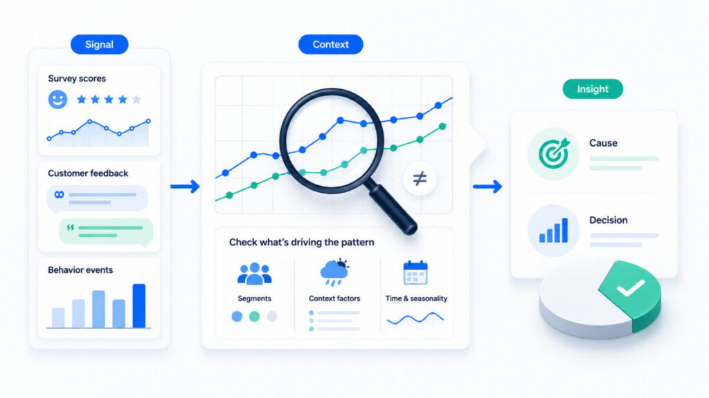
YourCX enables you to collect customer feedback at key touchpoints—website, app, checkout, customer service, and complaints. The platform combines quantitative data (NPS, CSAT, CES) with open-ended comments, behavioral data, and transactional context, making it easier to identify potential causal relationships rather than simple correlations.
Thanks to segmentation and filters, teams can determine whether an observed correlation applies to all customers or only to specific groups. The platform’s role is to provide context and facilitate the analysis of customer experiences—but the final conclusions and hypothesis testing remain in the hands of business teams.
In the real world, CX data rarely provides clear-cut answers. Here are five principles you can share within your organization:
If you want to better understand what truly influences your customers’ experiences—check to see if your conclusions are based solely on the assumption that an increase in one variable automatically implies a causal relationship with a change in another. This is exactly where YourCX helps—by linking feedback to the context of behaviors, segments, and touchpoints.
The following questions come up regularly during workshops and meetings with teams responsible for customer experience. The CX community is discussing this topic more and more often—here are some practical answers.
No. In the real world of business, we often act based on strong indications—correlations supported by context and customer feedback. The bigger and more expensive the decision (website redesign, change in delivery policy), the more important it is to conduct experiments and gather stronger evidence. For smaller improvements, a well-reasoned hypothesis based on triangulation is sufficient. Manipulating variables in experiments isn’t always possible, but striving for a better understanding is always worthwhile.
In high-traffic e-commerce, 2–4 weeks are often sufficient to obtain a stable signal. In subscription-based services (SaaS, telecommunications), assessing the impact on churn may require 2–3 months of observation. Reacting too early to the first few days after implementation—when users are still learning and the process is settling in—leads to conclusions based on random fluctuations rather than actual trends online and offline.
This is normal. More aggressive promotions may boost sales but lower satisfaction among loyal customers. In such situations: check the segments, review the comments, define the business priority, and communicate the trade-offs to management. The belief that one thing directly causes another is less useful than understanding which segments have gained and which have lost.
Use common identifiers—customer ID, session ID, order ID—and consistent definitions of journey stages. Establish a “source of truth” for the most important metrics (churn, number of orders), and CX tools should use this data as context. Any analysis based on separate insights and systems requires an understanding of how the data is interconnected.
Not necessarily. Even a weak correlation between a process change and a decrease in churn in the premium segment can have enormous financial significance, while a strong correlation in an area with less significant business impact is often useless. Viewing correlation through the lens of business value—revenue, cost, risk—is more important than statistical “power” alone. Third variables can influence observed correlations regardless of their strength, so it’s always prudent to verify the context.
Copyright © 2023. YourCX. All rights reserved — Design by Proformat
