

- Research platform
Sources of information
Data analysis
Actions

- Solutions
For whom
Problems / Issues

- Materials
Materials
- About us
About us
Heatmaps and click maps have become an indispensable tool for companies that want to gain deeper insights from customer surveys. With a visual representation of the data, heatmaps allow companies to easily identify patterns and areas of interest connected to customer feedback. This visual approach transforms the traditional process of sifting through textual feedback into an intuitive analytical experience, allowing companies to quickly pinpoint specific areas that need attention. What's more, heatmaps transform complex data sets into actionable data, facilitating a smoother decision-making process for companies by providing qualitative UX survey data that supports data-driven decisions to improve user experience and create design iterations.
The use of heat maps and click maps together with customer surveys enables companies to collect and analyze feedback more effectively. They serve as a guide to understanding customer behavior and preferences, identifying “hot” areas that may require immediate action or reveal underlying trends. Heatmaps are particularly effective because they provide a clear visual hierarchy of information, eliminating biases and misinterpretations that can result from analyzing raw data. By transforming complex data sets into engaging, colorful representations, heatmaps and click maps facilitate smoother decision-making.

Heatmaps are vital tools for visualising data in a way that highlights user behaviour and interaction patterns. They use colours to represent data intensity, making it easy to spot trends and areas of focus.
A heatmap is a data visualisation tool that uses colour to show the intensity or frequency of data points. Heatmaps are utilised to track and analyse where respondents click, hover, or spend most of their time.
This tool assigns colours to different data points, usually from cool to warm hues where warmer colours like red indicate higher activity, while cooler colours like blue show lower activity. The primary aim is to provide insight into user behaviour and optimise design and content based on actual user interactions.
There are several types of heat maps, each serving a specific purpose:
Click Maps: These show the areas where users click the most. This is essential for understanding which parts of a webpage or image attract the most attention.
Scroll Maps: These reveal how far users scroll down a page. They help identify if important content is being seen or missed.
Attention Heatmaps: These focus on where users spend the most time. They highlight areas of high engagement and can be used to optimise layout and content placement.
Using these varied heat maps, one can gather detailed insights into different aspects of the user journey and interactions, making it easier to improve user experience and engagement.
Clickmaps provide vital insights into user interactions on web pages or images. They visually display where users click, helping to identify patterns and improve user experience.
Clickmaps use a visual approach to display user clicks on a webpage or images. Warmer colours indicate frequent clicks, while cooler colours show fewer clicks. This visual representation helps identify popular areas in an image.
When users click on elements like buttons or links, the data is collected and displayed on the clickmap. This information is essential for understanding which parts of a page attract the most attention. For example, a clickmap can highlight a popular call-to-action button, ensuring it is in the optimal location for user engagement.
Interpreting click map data involves analysing the visual patterns to improve user experience. For instance, if a clickmap shows how many visitors have clicks on an unlinked image, it suggests adding a link there to meet user expectations.
Clickmaps can also reveal friction points. For example, if a map example that users frequently click on non-interactive areas, it may indicate confusion. By addressing these issues, you can streamline navigation and enhance usability. Regularly reviewing click map data ensures the website layout aligns with user behaviour, helping to increase overall effectiveness.
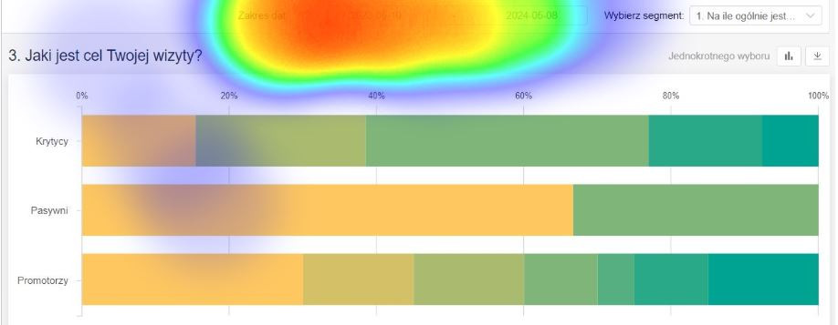
Heatmaps and click maps provide valuable insight into user interactions and engagement in surveys. These tools help refine the design of a page or ad and enhancing user experience by visualizing user behavior patterns.
Heatmaps and click maps help designers understand which parts of an image or page attract the most attention. For example, by analysing click maps on pages, designers can determine which elements of a page are most frequently clicked on and which are often skipped. This data is crucial to understanding and improving user preferences.
Heatmaps provide visual representations of user interactions, highlighting areas with high engagement. This information can be used to restructure content, improve the placement of important sections, and eliminate confusing or redundant parts. Furthermore, heatmaps offer a clear view of how users navigate through the website, allowing designers to streamline the layout for better flow.
One of the key advantages of using heatmaps and click maps is to improve the user experience. These tools reveal pain points where users may be struggling, such as confusing instructions or misplaced buttons. For example, if heatmaps show that users often click the wrong options, the design can be adjusted to address these issues.
Click maps can also highlight device-specific problems. If mobile users are having problems with certain parts of the site, adjustments can be made to improve compatibility with mobile devices. By resolving these issues, the site becomes more accessible and helpful to the target, leading to greater user satisfaction. It is crucial to support mobile devices in analytics tools to accurately track user interactions such as tapping, zooming and scrolling.
Collecting click data involves using specialised tools to identify user behavior and ensuring the accuracy of the data collected. These practices help in understanding user interactions on a website or application.
There are several tools available to collect click data effectively. Cux.io is one such tool that provides comprehensive click heatmaps, visitor recordings, and A/B testing features. Hotjar is another tool that lets users set up click heatmaps easily, allowing the collection of click data on e-commerce sites, blogs, and landing pages. These tools provide visual presentations of data, making it accessible even for non-technical users. Scroll maps, in particular, help determine the length of a webpage and how much content to keep 'above the fold'.
To ensure data accuracy, it’s crucial to set up the tools correctly. Proper tagging and configuration help capture the right data without missing key interactions. Placement and frequency of heatmap generation should be considered to avoid sampling bias. For example, covering diverse traffic times and user types is essential.
Using A/B testing alongside heatmaps can validate findings and refine the accuracy of collected data. Regularly updating and reviewing the tools is necessary to keep up with changing website elements and user behaviour. Frequent checking and calibration can also help maintain data integrity and relevance.
Analysing heatmap data involves understanding how users interact with various elements on a web page or images. It helps in identifying areas that need improvement and provides insights on user behaviour patterns.
Qualitative analysis of heatmaps focuses on understanding visitor behavior and user experience. By looking at where users click, hover, or scroll, businesses can identify usability issues. For instance, if a large number of users are clicking on non-clickable elements, it suggests a design flaw. Heatmaps can also show which areas capture attention, helping improve content placement.
Quantitative analysis uses metrics and numerical data. This involves measuring the frequency of clicks or hovers on specific page elements. For example, if a Call to Action (CTA) button receives fewer clicks than expected, this might indicate the need for better visibility or placement. Quantitative data provides a statistical foundation for making changes.
Converting data from heatmaps into actionable insights requires clear steps. Firstly, visualize complex data, identify patterns and anomalies that stand out. For instance, if a section of the webpage has high engagement, consider replicating its design in other areas.
Secondly, prioritise changes based on impact. Focus on high-traffic elements like main navigation or CTAs. For example, if users frequently click a button that isn't functioning properly, fixing or enhancing it often results in improved metrics quickly.
Lastly, continuously test changes. Implement small adjustments based on heatmap insights and monitor the results. This iterative approach ensures that optimisations are effective and align with user needs. By regularly analysing and adapting, businesses can create more engaging and user-friendly websites.
Heatmaps and clickmaps are crucial in various fields, notably e-commerce, advertising pre-testing, and mobile app development. These tools provide detailed insights, helping to optimise user experience and engagement.
E-commerce websites benefit greatly from using heatmaps and clickmaps. These tools visually display user interactions, showing where visitors click the most. This information helps teams identify which elements on a page are most engaging. For example, if users frequently click on a specific product image, it may indicate high interest, suggesting the need for better highlighting or promotional strategies.
By analysing these maps, businesses can re-arrange key elements like CTAs to increase sales. A click map can reveal unexpected behaviour, such as clicks on non-clickable elements, indicating potential design flaws needing attention.
Pre-testing advertising concepts with heatmaps and clickmaps allows marketers to predict which ads will perform best before launch. By simulating user interactions, marketers can see which parts of an ad capture attention and which get ignored. This enables the refinement of ad layout and messaging.
For instance heatmap tool can predict user reactions to new web pages, which assists in validating design choices. This data-driven approach leads to more effective ad campaigns, minimising the risk of failure upon launch. Heatmaps are especially useful in comparing different creative concepts to determine which will likely yield the best results.
Mobile app developers use heatmaps and clickmaps to understand how users engage with different features and improve user interfaces and experience. These tools highlight areas of high interaction and spots where users may be struggling. For example, a common finding from rage click maps might be that users often miss a crucial button due to its poor placement or size.
By analysing these patterns, developers can make informed changes. Adjusting the layout to align with user habits, like placing navigation buttons in easier-to-reach spots, enhances usability. Data from click maps also aid in tailoring interactions specifically for mobile users, ensuring a smoother and more intuitive experience across different devices.
Integrating third-party tools helps enhance survey data by using advanced visual analytics like heatmaps and clickmaps. These tools provide in-depth user behaviour insights, which can improve survey effectiveness.
There are several tools available for integrating heatmaps and clickmaps with surveys. YorCX offers advanced survey solutions with own analytics making it ideal for tracking user actions with survey answers. YourCX also integrates with different User Behaviour Analysis tools and solutions like CUX, Clarity and HotJar.
Crazy Egg provides A/B testing along with heatmap functionalities, allowing users to test different survey designs. It creates a clear visual representation of user behaviour.
CUX.io is another powerful tool for integrating heatmaps and clickmaps with surveys. CUX.io specializes in real-time user experience analytics, offering heatmaps, clickmaps, and session recordings. It is particularly known for its ability to capture detailed user interactions and provide actionable insights.
Each tool has unique features that can enrich the survey data analysis process. Businesses should consider key factors like pricing, user interface, and specific functionalities to choose the best tool for their needs.
Heatmaps and click maps are invaluable in analysing user behaviour, but they come with several challenges. These include dealing with biases and difficulties in data interpretation. Understanding these limitations helps in making more informed and reliable decisions.
Biases can significantly affect the accuracy of data gathered through heatmaps and click maps. For instance, a respondent’s current mood or emotional state can impact their interactions with a webpage. If a user is in a hurry or feeling stressed, their clicks might not reflect typical behaviour.
Another bias could stem from the sample group. If the majority of users come from a particular demographic, their behaviour may not represent the broader user base. This can skew the data, leading to misinterpretations.
Moreover, biases can also occur due to the device used. Clicking patterns can differ between mobile users and desktop users. It's crucial to account for these differences to ensure the data is reliable.
Interpreting data from heatmaps and click maps can be complex. Click maps use warmer colours for frequent clicks and cooler colours for fewer clicks. However, these visuals can sometimes be misleading without proper context.
For example, a high click rate on an element doesn't necessarily imply it is well-designed. It might indicate confusion, prompting users to repeatedly click on it, as noted in the context of user engagement.
Additionally, distinguishing between meaningful clicks and random clicks is essential for accurate analysis. In some cases, users might click on elements out of curiosity, not because they find them valuable.
Finally, heatmaps can sometimes show high activity areas that do not convert. This means that while many users might interact with a specific part of a website, it does not necessarily lead to the desired action, such as a purchase or sign-up.
Also heatmaps neither click maps answer questions why user is doing something. This is where advanced survey solutions come in hand like YourCX.
The future of heatmap technology is increasingly being shaped by advancements in artificial intelligence and the growing ability to predict user behaviour. These trends promise to make heatmaps more insightful and actionable.
AI and machine learning are revolutionising heatmap analytics. With AI, heatmaps can now automatically analyse large datasets, recognising patterns that humans might miss. This leads to more accurate predictions of user behaviour on webpages.
Machine learning algorithms can adapt over time, offering ongoing improvements in data accuracy. These tools can provide specific recommendations for website optimisation based on detailed user interaction data.
As AI continues to evolve, expect more precise heatmap insights that can drive higher engagement and conversion rates.
Predictive behavioural analytics is another significant trend in heatmap technology. With these tools, websites can anticipate user actions before they happen. Clickmaps offer valuable data for these predictions by highlighting areas of high interaction and identifying potential frustration points, like rage clicks.
Future tools will likely provide real-time predictions, allowing website owners to make instant adjustments. This can reduce bounce rates and increase user satisfaction.
Predictive analytics, combined with heatmaps, can give businesses a competitive edge by offering a deeper understanding of user intent.
Heatmaps and clickmaps provide invaluable insights into user behaviour. These tools enhance web analytics, helping businesses to thoughtfully refine their websites for better user experience and engagement.
Heatmaps use a colour-coded system to show where users interact most on a webpage or image. Warmer colours like red and yellow indicate high engagement areas, while cooler colours like blue and green show less activity.
Heatmaps help identify which parts of a webpage or image attract the most attention. They reveal areas that may need improvement, such as poorly performing call-to-action buttons or overlooked content sections. These insights can guide meaningful design changes.
Clickmaps illustrate exactly where users click on a webpage or image, highlighting popular and neglected areas. By examining these patterns, businesses can understand what users find engaging or confusing, leading to targeted improvements. Using this informations to run specific surveys can get really useful insights.
Heatmap data shows real-time user interactions, allowing site designers to make adjustments that improve navigation and overall user satisfaction. Adjustments based on this data can lead to increased engagement and better conversion rates.
Unlike traditional analytics which offer numerical data and broad overviews, heatmaps provide visual and specific insights. While traditional tools might show most-visited pages, heatmaps show the exact areas within those pages that attract attention.
Heatmap analysis tools can be combined with surveys and other data-gathering methods to provide a fuller picture of user experience. Integrating these tools helps in cross-referencing quantitative and qualitative data, leading to more well-rounded insights into user behaviour.
Copyright © 2023. YourCX. All rights reserved — Design by Proformat
