Home / Blog / Why Don't Users Complete Forms? Analyzing Friction in Online Processes
Why Don't Users Complete Forms? Analyzing Friction in Online Processes
05.06.2026
Key findings (summary for the busy)
An abandoned form is rarely a lack of interest - much more often it's the result of UX friction that can be identified and removed. Here are the key theses of this article:
Friction, not intent - validation errors, mobile issues, lack of trust and hidden costs are responsible for most abandonments. Estimates show that 70-90% of visits end in form abandonment, and more than 80% of shopping processes on mobile devices are abandoned.
Quantitative data is only half the picture - Google Analytics, form logs and heatmaps will show where a user is dropping off, but only feedback (micro surveys, Voice of Customer) will explain why.
Measure effort, not just conversion rate - Customer Effort Score, average time to complete and error rate better describe the quality of the process than completion rate alone.
Iteration yields results - A/B testing can increase form completions by 20-30%, and closed-loop feedback can sustainably raise checkout, registration and lead form conversions.
Introduction: an abandoned form is not always a lack of interest
In Poland, the rate of abandoned shopping carts in e-commerce oscillates around 67-75%, and the average e-commerce conversion is only 2.5-3%. This means that the vast majority of users who get to an online store's website and start the process do not reach the order finalization. The problem doesn't only apply to checkout - we see similar abandonments in registration forms, B2B lead forms, online credit applications, SaaS onboarding, and even return and complaint forms.
Managers often interpret these abandonments as a "weak lead" or lack of purchase intent, ignoring UX friction and trust issues. Meanwhile, effective form optimization requires understanding both where users are dropping out (web analytics) and why they are dropping out (user feedback). This article is aimed at e-commerce managers, CX/UX designers, product owners and CRO teams looking for a methodical approach to analyzing friction in online processes.
What is friction in online forms and processes?
Friction in the context of forms is anything that increases the cognitive, emotional or operational effort required to complete a process. It doesn't have to be a critical error - it's the sum of small obstacles that combine to lead to abandonment. As many as 92% of consumers are afraid of sharing data on unfamiliar sites, which shows how strong the emotional barrier is.
There are three main types of friction:
Cognitive - unclear purpose of the form, incomprehensible questions, lack of information about what the potential customer will receive upon completion.
Emotional - concerns about data privacy, lack of trust in the site, hidden fees and opaque costs influence users' decisions.
Technical - validation errors, mobile UX problems, slow loading, autocomplete not working.
Examples: checkout, where only on the last step a high delivery cost appears (emotional friction → checkout abandonment); a B2B lead form with a dozen mandatory fields like position, turnover or industry (cognitive friction); a contact form that works poorly on mobile (technical friction, rage clicks).
The goal of UX friction analysis is to lower effort (Customer Effort Score) while maintaining business goals - such as higher data quality and lead qualification.
The most common reasons why users do not finalize forms
Users abandon online forms due to numerous fields to fill out, technical problems and lack of confidence. Below are the most common reasons - each a potentially eliminable friction point. A complicated shopping process increases shopping cart abandonment, so every element should be analyzed.
Too many fields - a classic example is a B2B lead form with 15 required fields (TIN, number of employees, revenue, URL, position). Too many fields increase cognitive effort when filling out forms. Long forms result in 20-30% higher abandonment rates compared to short stages. Shortening a form to 6-8 fields can change the conversion rate by several percentage points.
Unclear purpose of the form - a registration form without an explanation of what the user will receive (trial access? newsletter?) results in a lack of motivation. Lack of "why" information is serious friction.
Lackof information on how long the process will take - a credit application without a progress bar raises user concerns. Lack of a step-by-step breakdown of forms discourages users.
Mandatory account registration - forced account creation before a transaction increases shopping cart abandonment. Guest checkout increases conversions.
Askingfor personal information too early - SaaS demo form asking for phone right away before the user knows the value of the product. This affects user behavior and exacerbates mistrust.
Lackof trust in the site - no HTTPS, no privacy policy, little-known brand. 70% of shopping carts are abandoned due to lack of trust. Concerns about data security lead to form abandonment.
Validation errors and incomprehensible messages - return form with "Field invalid" message without instructions. Aggressive validation in forms leads to frustration from lack of feedback. Invisible or incomprehensible error messages lead to user frustration.
Lack of automatic progress recording - an online application that deletes data when refreshed drastically reduces return rate.
Problems on mobile and autocomplete not working - a contact form with small fields and a poorly chosen mobile keyboard. More than 80% of purchase processes on mobile devices are abandoned.
Hidden costs or unexpected terms and conditions - checkout, where only at the last step does the payment commission appear. Lack of price transparency lowers customer confidence.
Too difficult to confirm identity - two-step verification in fintech onboarding, poorly described, is a typical pain point of a particular financial industry.
Lack of preferred payment method - checkout without BLIK or deferred payments prompts abandonment. A lead form with a mandatory "phone" field without an email contact option.
Low readability of CTAs and distractors - a "Send" button in a different color with little contrast to the background, surrounded by links and checkboxes. In SaaS onboarding, the lack of a clear "next step" often stops the user.
Privacy concerns - a form asking for PESEL without explaining the purpose and legal basis. Requiring unnecessary information lowers form conversions.
Field duplication - duplication of fields in forms (e.g., "repeat email") can lead to user annoyance.
Technical failures - users abandon forms due to technical failures and long page load times.
Which online forms are worth analyzing for friction?
Friction analysis is not just about checkout - it covers the entire customer journey path and various website functionalities. Here are the types of forms that should be analyzed:
Checkout in e-commerce - the most common area of analysis (checkout abandonment). Key: analysis of delivery costs, payment methods, address steps and the need to scroll the screen.
Registration forms - accounts in subscription services, marketplaces. Typical frictions: strong password requirement without prompts, mandatory email confirmation.
Contact form - on a B2B site where contact is the main goal. Mobile UX, simplicity and clear message about response time are essential.
Lead form - inquiry for SaaS offerings. Conflict between lead qualification and low entry threshold affects marketing efforts.
Newsletter signup - minimalism (1-2 fields) and clear value message. Even here friction happens (email validation error, no success message).
Credit/insurance application - multi-step process with sensitive data. A progress bar and a record of draft versions is a must.
Return and claim form - customer under pressure to have a negative experience. The quality of this process affects loyalty and NPS.
Reservations and booking - booking an appointment, hotel, ticket. Friction associated with appointment selection and booking confirmation.
SaaS onboarding - lack of a clear "next step" and too many options at the start decrease activation.
What quantitative data is worth analyzing in forms?
Analyzing quantitative data answers the "where and when" questions users drop off. Google Analytics has an 86.5% market share in analytics tools, and Hotjar is used by nearly 900,000 sites to track behavior. These are key metrics worth monitoring:
Completion rate - the number of completed forms divided by the number started. Monitor changes after modifications (such as shortening a form).
Abandonment rate - the inverse of completion rate. Example: an increase in checkout abandonments after a change in delivery costs.
Field-level drop-off - thanks to form logs, you can see at which field users abandon (e.g., TIN, phone, PESEL field). Example: online application, where the most drop-offs are at the "net income" field.
Time to complete (time to complete) - average timeto complete and time on individual fields. Very long time at one field signals vagueness of the question. Long forms are more difficult to answer than short stages.
Error rate - the percentage of sessions with an error on a given field. High error rate is due to non-intuitive format (phone, zip code, password).
Rage clicks and scroll depth - heatmaps and session recordings help analyze user behavior by showing strong signs of frustration (repeatedly clicking on a non-clickable item, having to scroll for a CTA).
Device split - analyze mobile and desktop metrics separately. Example: checkout with good results on desktop and lower mobile conversion due to small fields and lack of autocomplete.
Return rate - percentage of users returning to an unfinished form within 7 days. A high return rate with a low completion rate suggests frustration, not lack of intent.
It is worth remembering that Google Analytics only stores data for 25 months - regular reporting and data export is important for long-term analysis. Yandex.Metrica allows you to set as many as 200 goals for analysis, which can be useful for complex forms.
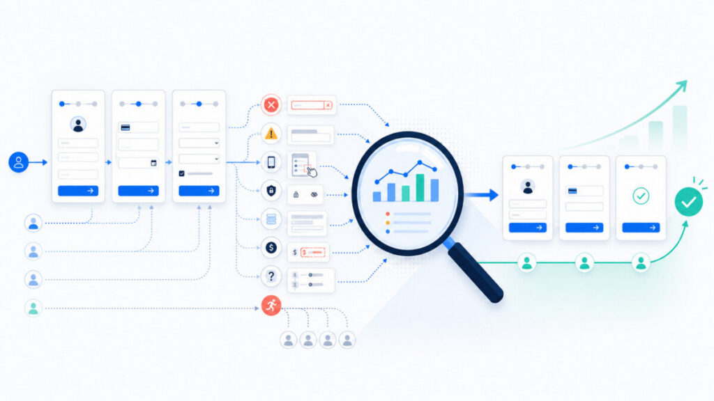
Why isn't web analytics alone enough to understand form abandonment?
Google Analytics, form logs, heatmaps and session recordings are great at showing user behavior, but they don't speak directly to motivations and barriers. Analyzing user behavior can identify areas of impediment - but that's just the starting point. The difference between "what happened" and "why it happened" is crucial.
Checkout example - GA4 shows a sharp increase in abandonment at the delivery cost step. Only user feedback reveals that the problem is not only the price, but also the lack of information about the delivery date.
Registration example - volume data shows an outflow at the "password" field. Contextual surveys show that the user does not understand the password requirements.
Google Analytics will not provide information on subjective effort (Customer Effort Score) or direct answers to "what was unclear?" questions. Combining quantitative data with Voice of Customer can distinguish a UX problem from an offer problem (price, terms) and from a lack of purchase intent. Referral sites and search results provide context about the source of the traffic, but do not explain why the user abandoned after entering the site.
How do you collect feedback from users who aborted the process?
The best feedback about a form comes from the "here and now" - at the moment of friction, not a week later in a general satisfaction survey. Aggressive real-time validation is annoying to users, but a well-designed micro survey at the moment of abandonment yields invaluable insights.
Exit intentmicro surveys - detect exit intent (cursor movement to address bar, fast scrolling). Form: 1-3 questions, one open-ended about the reason for abandonment.
Surveys at the time of error - after several unsuccessful attempts to send a claim form, a short question about the problem appears. This allows you to collect real-time feedback when a validation error occurs.
Follow-up after an uncompleted process - a user started a claim, entered an email, but did not complete it. After 24-48 hours, an email asking for a brief assessment of the difficulty of the process.
Contextual surveys onselected steps - in SaaS onboarding a short CES after a key configuration step. No need to ask everyone - a random sample is sufficient.
A CX platform (like YourCX) allows you to place contextual surveys on specific steps of a form, trigger them after abandonment or error, tag answers and link them to behavioral data (path, device, traffic sources).
What questions to ask in micro surveys when a form is abandoned?
Questions should be simple and answerable in less than 30 seconds - otherwise they will become another abandonment form themselves. Here are ready-made questions:
Question
What insight does it provide?
What prevented you from completing the form?
Identify the real barriers (open-ended)
Was the form understandable to you?
Assessment of cognitive friction
Did you know how many steps were left to complete?
Verifying the need for a progress bar
Was any question unclear or redundant?
Indicating a specific field for optimization
Was there an error that could not be resolved?
Detecting technical problems
Did the form require data you did not want to provide?
Privacy boundaries (PESEL, phone)
How easy was it to go through the process? (scale of 1-7)
Customer Effort Score
What could we simplify?
Direct insights to improve UX
Would you come back later to complete the process?
Distinguishing between lack of time and a permanent barrier
How to analyze open comments and categorize problems?
Open-ended comments in CX surveys are a source of the most valuable insights, but they require systematic analysis - not just "reading from time to time." Answers should be assigned to problem categories (tags). Modern tools like CX platform help automate tagging based on keywords and language models.
The base set of tags for friction analysis: "form too long", "technical error", "unclear message", "lack of trust / data concerns", "cost / terms and conditions", "mobile UX problem", "validation / data format", "required account / login", "lack of appropriate option (payment, contact)", "problem with offer".
Practical process: collect a sample of 200-500 responses, manually tag the first batch, and then use automatic tagging in a tool like YourCX. The importance of combining tags with quantitative data - e.g., a high percentage of the "cost" tag among users abandoning checkout on the last step, or the "mobile UX" tag dominating responses from mobile devices on the contact form.
How do you segment the results and detect patterns in user behavior?
Without segmentation, it's easy to average out results and miss key differences. The growing amount of data requires precise segmentation:
Traffic source and campaign - performance ads in Google Ads can generate a lot of sessions with high lead form abandonment. Different type of intent (research vs. purchase) requires different form design.
Devices - compare completion rate and CES on desktop vs mobile. A contact form with good conversion on desktop but low on mobile due to lack of autocomplete is a typical pattern.
Customer type - B2B vs B2C, new vs returning customer. Users with a high cart value may be more likely to fill out a longer form, but are more sensitive to signals of mistrust.
Stage of customer journey - at the awareness (newsletter) stage, mistrust dominates, at the decision (checkout) stage, cost and conditions dominate.
Form type - abandonment of registration form, lead form and return form have naturally different levels of friction - don't compare them 1:1.
How to translate insights from friction analysis into improved UX and conversions?
Analysis without concrete action has no value. Here's how to translate insights into changes:
Simpler forms - keep the number of mandatory fields to a minimum. Ensure logical grouping and consistent order of fields (personal information → delivery → payment).
Progress and security signals - a form with a progress bar increases completion by 20-30%. HTTPS on the site increases users' sense of security. Testimonials and reviews increase trust in online store.
Prefill and autocomplete - use of saved data and autocomplete, especially on mobile. Example: autocompletion of the city after entering the postal code.
Saveprogress - the ability to save a draft version (link "complete the process"). Benefits for B2B credit applications and onboarding.
Better error messages - in user language, with specific instructions. Inline validation after exiting the field, not only after attempting to submit. Information should be presented in a clear way.
Improve CTAs - clear buttons like "Go to payment" instead of "Send". Removal of distractors on key steps.
Mini-case: in the checkout of the online store, after detecting that 40% of the comments are related to delivery costs, free delivery from a certain amount was introduced and information about it already on the product page. In the B2B lead form, after insights from reports, it was shortened from 12 to 6 fields and some questions were moved to a later stage of the sales contact.
How to test changes to forms and measure their effects?
Every form modification should be treated as a hypothesis to be tested. A/B testing is crucial in the conversion optimization process. A/B testing allows you to compare versions of a form with a single change - e.g. checkout with progress bar vs. without, registration form with "register later" option. A/B tests increase form completions by 20-30%.
A/B testing (a b tests) - test one element at a time. Tools such as the former Google Optimize (replaced by newer solutions) or experiment software allow you to control variability.
Usability tests - short sessions with 5-8 users observing form filling. They reveal problems not visible in numbers.
Pilots - implementing changes for a portion of traffic (e.g. mobile, a specific campaign). Monitor metrics before releasing to everyone.
Before/after analysis - compare key metrics (completion rate, abandonment rate, average fill time, CES). Take into account seasonality and changes in traffic sources.
Conversion optimization can increase sales without additional ad spend. Use GA4 to monitor conversion rates, and the CX tool (YourCX) to measure CES and track whether the number of complaints per form step is dropping.
How do you combine data from GA4, heatmap, form logs and CX surveys?
A full picture of friction only emerges when several data sources are combined. Each source has its own role in the analytics ecosystem.
Google Analytics 4 - path reports (path exploration) and funnels (funnel exploration) for drop-off analysis. Integration of form events (start, submit, error, abandon). Conversion tracking and rejection rate give a basic picture.
Heatmaps and session recordings - read click and scroll maps. Example: users on mobile scroll below the form looking for a phone number instead of submitting it.
Form logs - completed fields, order, validation errors, time in field, number of submission attempts. Field-level analytics reveals user behavior in the context of specific fields.
CX and Voice of Customer surveys - micro surveys and CES provide context. Tagging comments and linking to session data (traffic source, device, form type).
Practical example: checkout GA4 indicates drop-off at delivery costs, heatmaps show increased activity at the cost section, logs confirm multiple reloads of the delivery selection page, and CX surveys reveal that customers don't understand why COD shipping is much more expensive. This leads to concrete changes: a clear comparison of delivery methods and information about free delivery thresholds already on the product page.
How do you distinguish a form UX problem from an offer problem or lack of intent?
Not every abandonment means a UX error - some visitors are simply not ready for a purchase decision. Here are the whistleblowers:
UX problem - high error rate, rage clicks, "form doesn't work" comments, "I don't know what's going on." Priority: technical improvement.
Offer problem - "cost" / "terms and conditions" tag dominating comments, correctly going through the steps and cancelling at price. Priority: work on offer and value communication.
Lack of intent - users from awareness channels (social ads), "just checked options" responses. Priority: campaign and communication alignment.
Decision matrix: high drop-off lots of errors comments about difficulty → improve UX. Correct performance no errors comments about price → work on offer. Low interaction traffic from the top of the funnel → adjust the campaign.
How to close the feedback loop: from friction detection to measurable improvement?
Friction analysis is an ongoing process, not a one-time audit. Closed loop diagram:
Detection of a problem - increase in abandonment in GA4 negative CES at a given step.
Hypothesis - e.g., "users are abandoning because they are afraid to provide a phone number."
Change - description next to a field, making it optional, adding another contact method.
Test - A/B or pilot for a selected segment.
Re-measure - completion rate, CES, number of comments with "phone" tag.
It is important to share insights with marketing, UX, IT and sales teams. Simple dashboards with key metrics (conversions, CES, problem categories) build engagement with the organization. The CX platform can support this cycle with automated alerts when CES drops and dashboards linking survey results to segmentation.
The most common mistakes in online form analysis
Many teams make repetitive mistakes that lead to false conclusions:
Treating every drop-off as a lack of interest - ignoring error data and comments results in abandoning potentially valuable leads.
Analyzing only at the level of the entire form - an overall completion rate of 40% masks the fact that 80% of drop-offs happen at a single field.
Focusing only on desktop - an increasing number of visits are coming from mobile, and desktop-first designed forms are losing effectiveness.
Lackof effort measurement (CES) - satisfaction with conversions despite a process perceived as "very difficult" risks poorer loyalty.
Lack of systematic feedback - a one-time survey instead of continuous monitoring.
Implementing too many changes at once - difficulty in assessing which change had an effect, risk of UX regressions.
Form friction analysis checklist
Practical checklist - to be used as a "download" for each review:
Quantitative diagnosis:
☐ Form funnel configured in GA4 (start, steps, submit)?
☐ Monitor completion rate, abandonment rate, field-level drop-off, error rate, time to complete?
Qualitative analysis:
☐ Do you collect micro surveys at form abandonment?
☐ Are you using CES for key processes (checkout, application, onboarding)?
UX and technicalities:
☐ Form tested on mobile (different browsers, systems)?
☐ Error messages understood and shown with appropriate fields?
Data and trust:
☐ Any sensitive data type has a justification ("why are we asking")?
☐ Site clearly communicates security and privacy policies?
Iterations and testing:
☐ Prioritized list of hypotheses for A/B testing?
☐ After changes, do you measure not only conversion, but also CES and the number of problems reported?
FAQs - questions that teams responsible for forms often ask
Should every form have a progress bar?
A progress bar makes sense for multi-step processes (checkout, application, onboarding), especially when they exceed 2-3 screens - then it strongly reduces uncertainty and abandonment. With very short forms (1-2 screens), the bar may be unnecessary and even suggest that the process is longer than it actually is.
How many fields in a form is "too many"?
There is no one number for everyone - for a simple B2C lead, 3-5 fields are optimal, but for a credit application, naturally there are more. The key is to relate the number of fields to the stage of the path (the earlier in the funnel, the fewer fields) and to test viable options. According to the Baymard Institute, the average checkout has about 14.9 fields, and optimally there should be 6-8.
How often should we update our forms analysis?
Key business forms (checkout, registration, main lead forms) are worth monitoring constantly, and a detailed review should be done at least quarterly. In addition, the analysis should be repeated after any major change in the process (new fields, new delivery model, rebranding).
Won't micro surveys discourage users even more?
Well-designed micro-surveys (1-3 short questions, appearing only at abandonment or for a select sample of visitors) have minimal impact on the experience, but provide tremendous cognitive value. Avoid obscuring the form with a pop-up as it is being filled out - it is best to survey after the decision to abandon (exit intent) or after the form is submitted.
How do you start if you haven't analyzed forms at all so far?
Start with 1-2 key forms (e.g., checkout and main lead form). Set up step tracking in GA4, run one short exit intent micro survey and collect the first 100-200 responses. On this basis you will identify the first frictions, plan small A/B tests and gradually expand the analytics ecosystem (heatmaps, session recordings, CX platform for advanced feedback analysis).
Summary
Abandoned forms are mostly the result of UX friction, lack of trust and too much effort - not "bad traffic." Effective online form analysis requires a combination of quantitative data (GA4, form logs, heatmaps), qualitative data (micro surveys, CES, user comments) and segmentation (traffic source, device, customer type, form type). Teams that systematically measure friction, test changes and close the feedback loop achieve sustainable conversion growth without having to continually increase the media budget. In practice, this means not only higher revenue, but also a better customer experience and fewer support contacts asking for help in filling out a form. Conversion optimization can increase sales without additional expenses - all you need to do is systematically remove what gets in the way of users' improved experience with your product.